
Typeface Anatomy

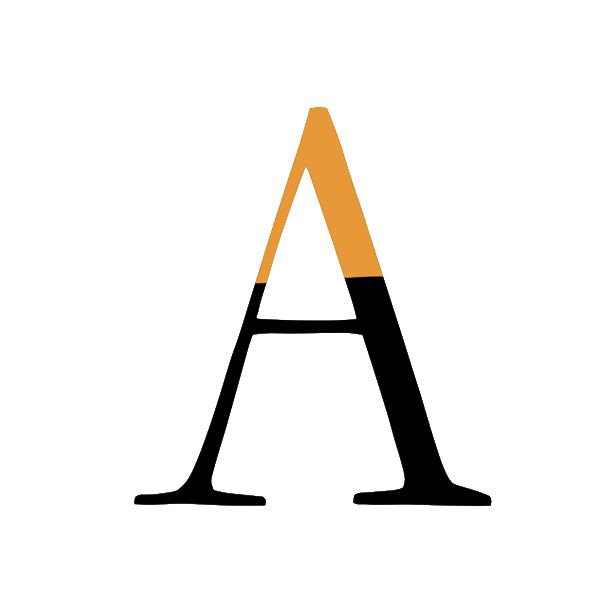
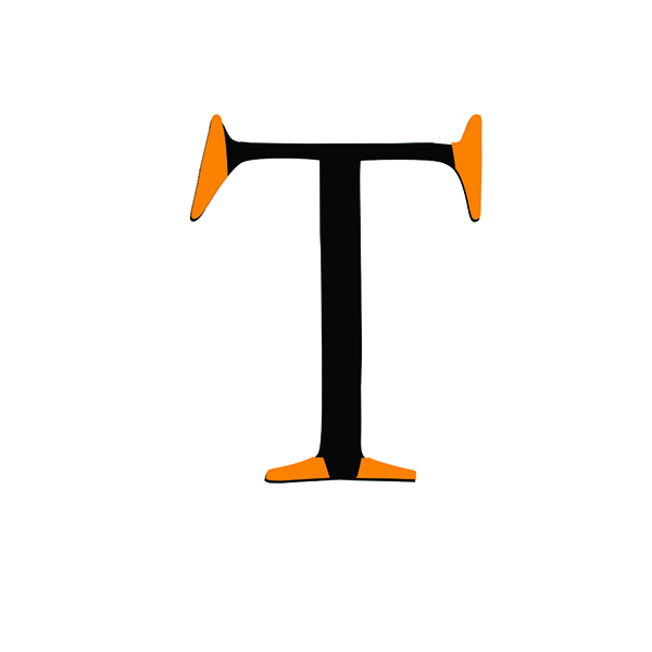
Arm
A horizontal or upward stroke that extends from a letter, as seen in T, F, K, or Y. The arm reaches outward, shaping the letter’s direction and balance. It shows how a simple extension of form can influence the movement and character of a shape.
Apex
A horizontal or upward stroke that extends from a letter, as seen in T, F, K, or Y. The arm reaches outward, shaping the letter’s direction and balance. It shows how a simple extension of form can influence the movement and character of a shape.
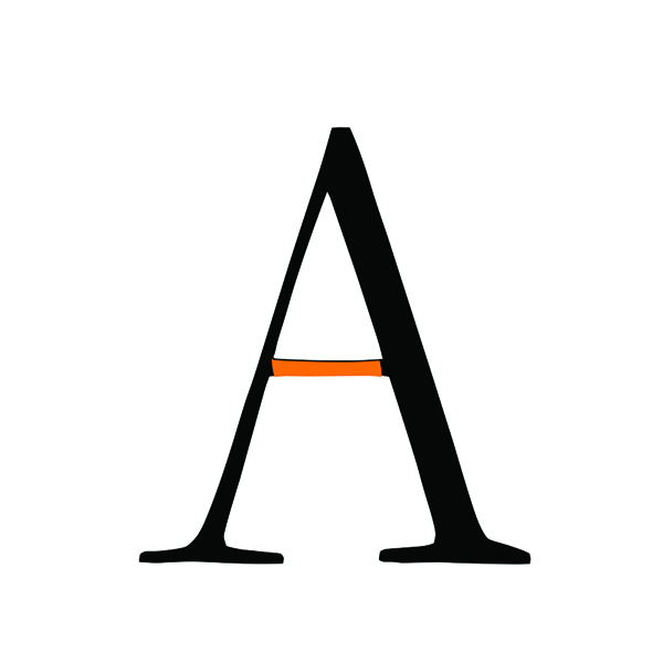
Crossbar
A horizontal stroke that crosses the main stem of a letter, as seen in A or H. This simple line introduces balance and structure, showing how a single shape can define the rhythm and stability of a letter. Even the most minimal form plays a role in shaping the character’s identity.

Barb
A small, sharp serif that finishes the end of a stroke. Though subtle, this pointed detail adds tension and precision, showing how even the smallest shapes can influence the personality and elegance of a letter.
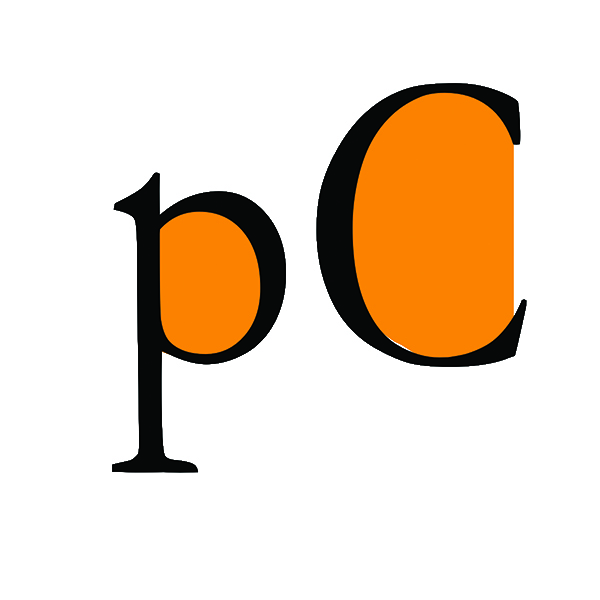
Bowl
The curved shape that forms and encloses the rounded part of a letter, as seen in B, P, or O. This circular form creates the inner space of the letter, revealing how soft, continuous shapes bring volume, balance, and harmony to typography
Counter
The open space inside a letter’s bowl. This inner shape is just as important as the stroke itself, showing how negative space helps define the balance and clarity of a letter.

Chin
The angled terminal at the end of a G. This small, slanted shape adds character and direction, showing how subtle angles can influence the rhythm and personality of a letter’s form.
Serif
A small finishing stroke at the end of a letter’s main vertical or horizontal lines. Though subtle, this detail plays an important role in shaping the letter’s character and style. Serifs add rhythm and structure to typography, showing how even the smallest shapes can influence the balance and elegance of a form.

Loop
he curved bowl created by the tail of a g. This rounded form adds movement and depth, showing how flowing shapes can bring rhythm and softness to a letter’s structure.
