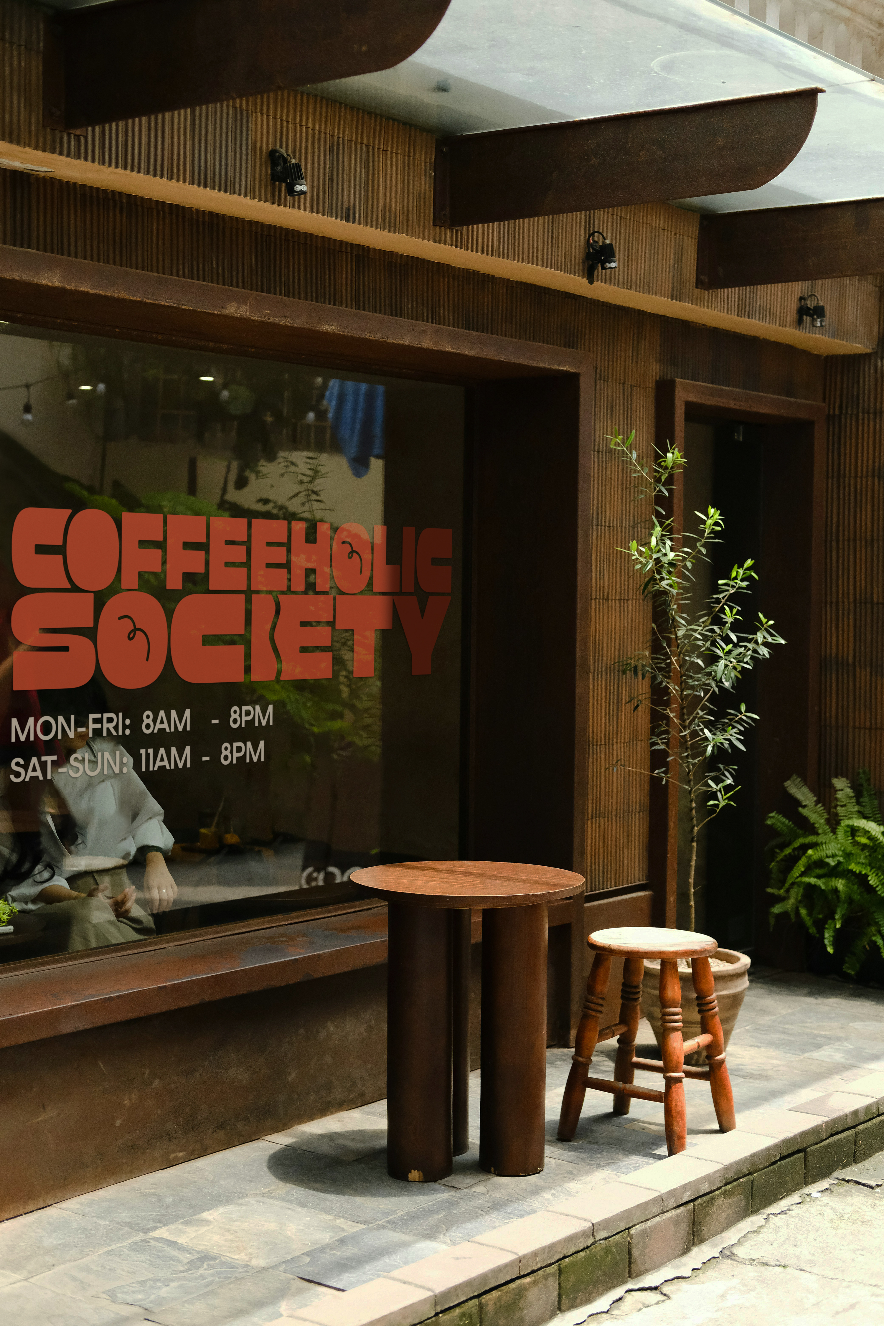


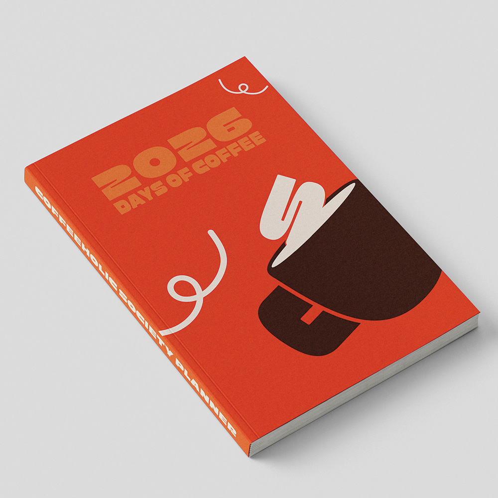
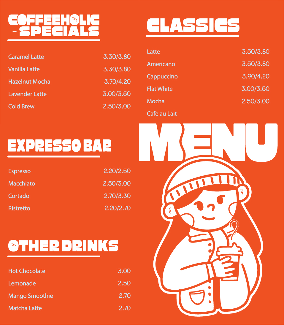
This visual identity was created for a coffee shop, focusing on community, playfulness, and strong brand recognition. The system combines bold typography with illustrative elements to create a lively and engaging experience. Every design prioritizes readability while maintaining a distinctive personality through color blocking and graphic icons. The identity extends across multiple touchpoints, including merchandise, logo design and printed materials, ensuring a cohesive and memorable brand presence.




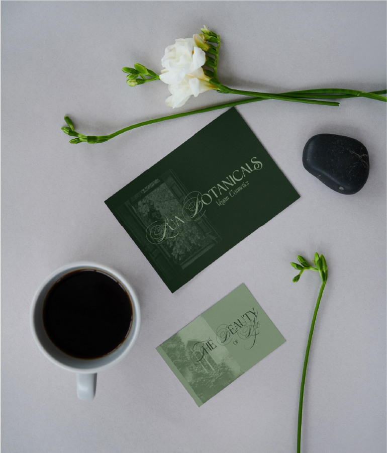
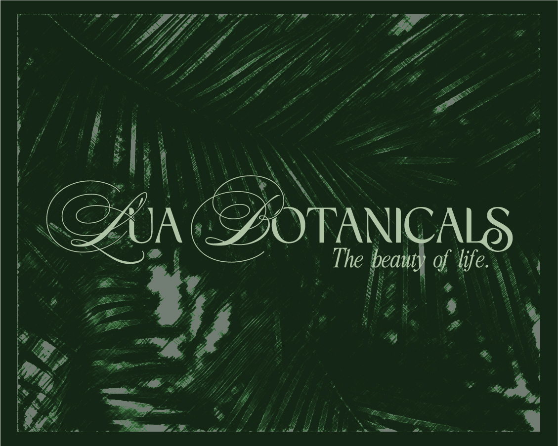
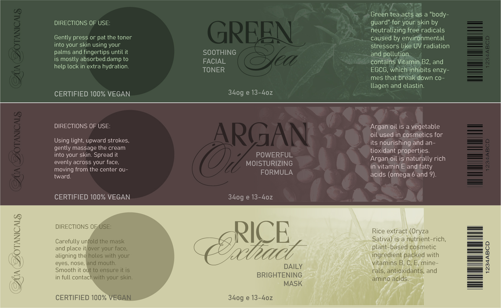
This visual identity was created thinking on a vegan cosmetics brand centered on sustainability, purity, and self-care. The concept draws from the relationship between nature and the human body, using organic shapes and soft gradients to evoke a sense of calm and balance. The color palette is inspired by natural tones, reinforcing the brand’s commitment to clean and ethical products. The logo and graphic elements incorporate botanical influences, creating a visual system that feels both modern and grounded.




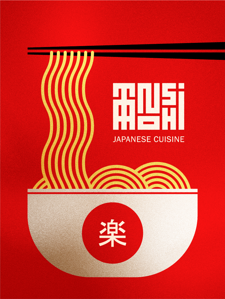
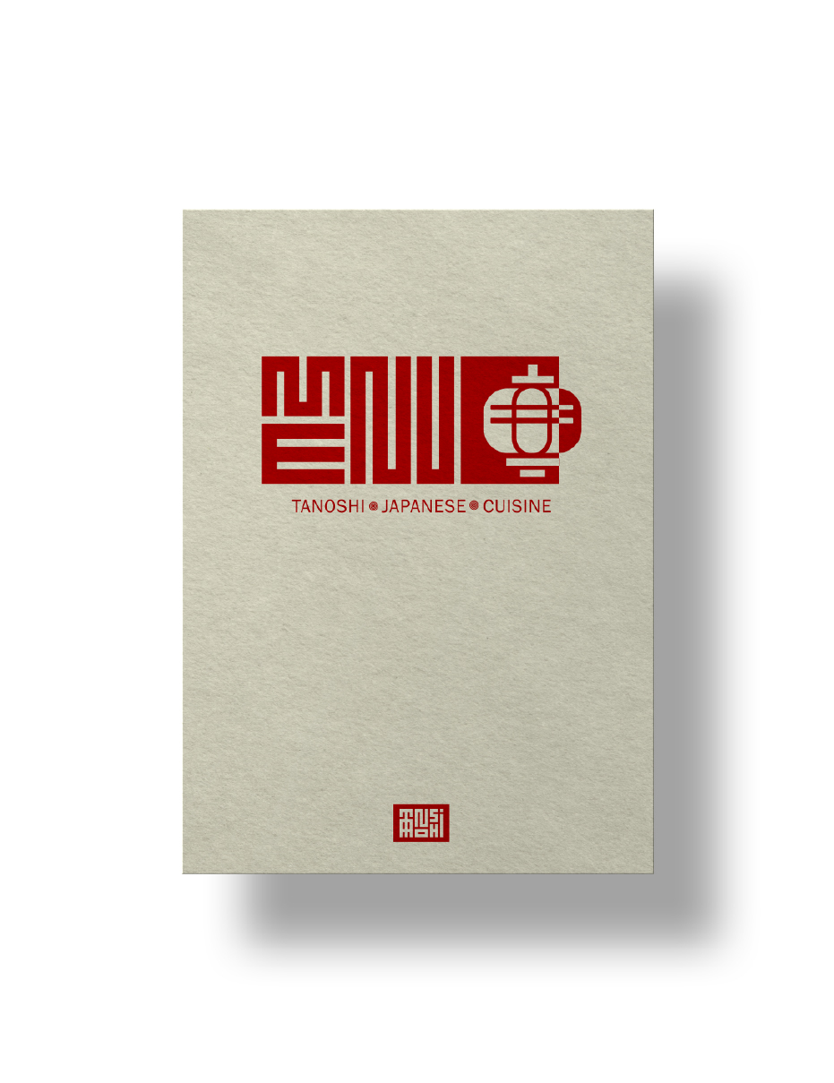
This project explores a bold visual identity for a Japanese restaurant, inspired by traditional aesthetics and contemporary graphic design. The concept focuses on simplicity, contrast, and cultural symbolism, using a limited red and white palette to create a strong and recognizable presence. Typography and layout take inspiration from Japanese design principles, emphasizing structure, balance, and negative space. Graphic elements and patterns reference traditional motifs while being reinterpreted in a modern way